
Woof off Your Stress
︎︎︎ web app design
︎︎︎ front-end prototyping
︎︎︎ design for social good
︎︎︎ UX case study
︎︎︎ front-end prototyping
︎︎︎ design for social good
︎︎︎ UX case study
A dynamic serving web app that helps to engage users' mind and body to divert their attention from anxiety and stress
Roles
︎︎︎ UX/UI designer
︎︎︎ developer
︎︎︎ UX/UI designer
︎︎︎ developer
Time
︎︎︎ Oct. - Dec. 2018
︎︎︎ Oct. - Dec. 2018
Tools
︎︎︎ Adobe XD, ProtoPie
︎︎︎ HTML, CSS, JavaScript
︎︎︎ Node.js, jQuery
︎︎︎ Adobe XD, ProtoPie
︎︎︎ HTML, CSS, JavaScript
︎︎︎ Node.js, jQuery
Discipline
︎︎︎ digital product design
︎︎︎ digital product design
Collaborators
︎︎︎ Lisa Ho (UI/UX, illustration & motion graphics design)
︎︎︎ Seong Jin Park (motion graphics design)
︎︎︎ Lisa Ho (UI/UX, illustration & motion graphics design)
︎︎︎ Seong Jin Park (motion graphics design)
Project Overview:
Problem
Stress has been a growing force in our society especially in the digital age we are in now. With our group members’ background and interest in mental health, we decided to focus on the issue of stress.
Solution
For our project, we are creating a website that prompts users to use their phone to play a mobile task-oriented game that requires body movements. This helps to engage their mind and body, not necessarily to reduce stress but to divert their attention from thoughts and problems. In the end, users are prompted to return to the desktop website to smile for the camera and enter a code to unlock a “reward” which is a personalized art pattern with easing motion.
Hi-Fi Prototype
Click on the phone screen below to woof off your stress!
(created in Adobe XD)
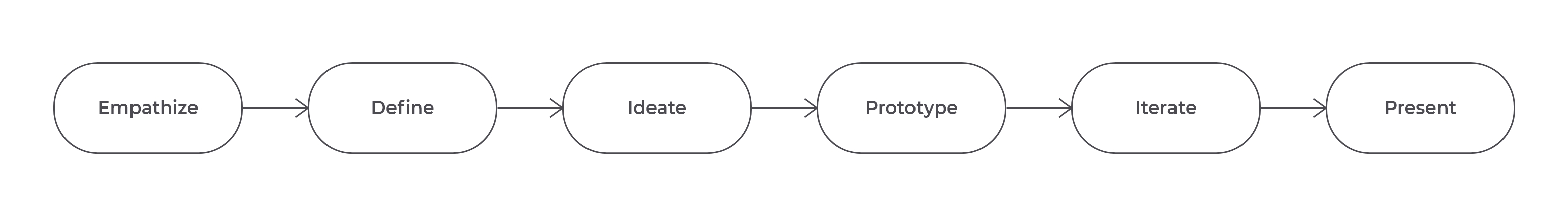
Design Process
Design Process
Research & Design Methods
︎︎︎ Secondary research
︎︎︎ User interview
︎︎︎ Requirements & constraints gathering
︎︎︎ Persona building
︎︎︎ User story
︎︎︎ Journey mapping
︎︎︎ Competitive analysis
︎︎︎ Design review
︎︎︎ Prototype testing & feedback
Deliverables
︎︎︎ Persona
︎︎︎ Storyboard
︎︎︎ User journey map
︎︎︎ Competitive analysis report
︎︎︎ Flowchart
︎︎︎ Sitemap
︎︎︎ Wireflow
︎︎︎ Lo-Fi prototype
︎︎︎ Hi-Fi prototype
︎︎︎ Tech protoype
︎︎︎ Design system
What I Worked on
- Participated and contributed to all the meetings throughout the whole design process
-
Created all the infographics and storyboards based on findings from research
- Built interactive prototypes, including interaction design for components, and experimented on tech prototypes
Empathize:
Technology vs Mental Health
There is no doubt that as technology advances, more products and services are being digitalized, there will be more screen time and use of our phones, tablets, and computers. However, much research has shown that more screen time on our digital devices, the more stress we seem to get. It is an easy solution to say just cutting down screen time, but it’s also hard since so much of our life is tied with the Internet now. With this in mind, how do we use technology as a way for us, not against us?
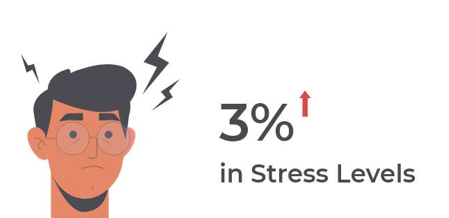
According to the annual "Stress in America" survey released by the American Psychological Association, American stress levels rose from 4.8 to 5.1 out of 10, between August 2016 and January 2017 among 3440 adults ages 18+ who reside in the U.S. Besides, young Americans continue to report higher stress levels than older generations.
Based on our research, we decided to focus on how technology can address the issue of stress for younger generations.
Define:
Target Audiences
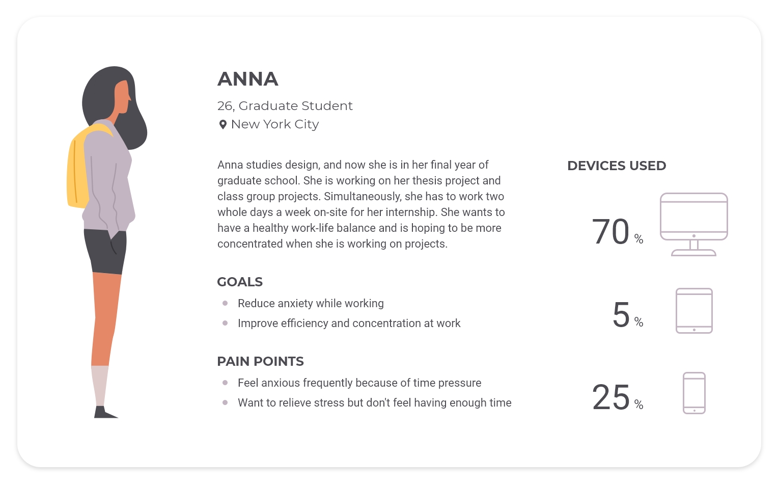
Our target audiences are college/postgraduate students and early young professionals who have stress and work/projects in their daily life. They lead a busy and in some ways, a stressful life. Therefore, to get to know more about our target audiences and create personas, we did 5 interviews with college/postgraduate students and 5 interviews with young professionals who were in their 20s.
Anna and Jim are our personas whom we identified through our research and user interviews. We concentrated on their needs through the process of designing the website.
Personas
-
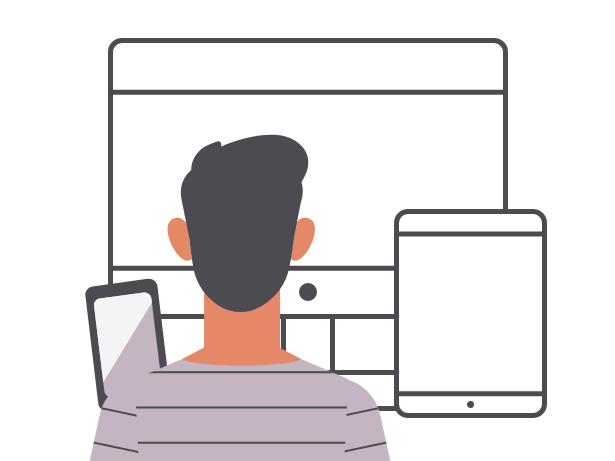
They sit and work in front of their computers for 70% of the time at work.
-
Time pressure from their projects lead them anxiety and cause stress.
- Stress and anxiety distract them from their work and influence their work performance.

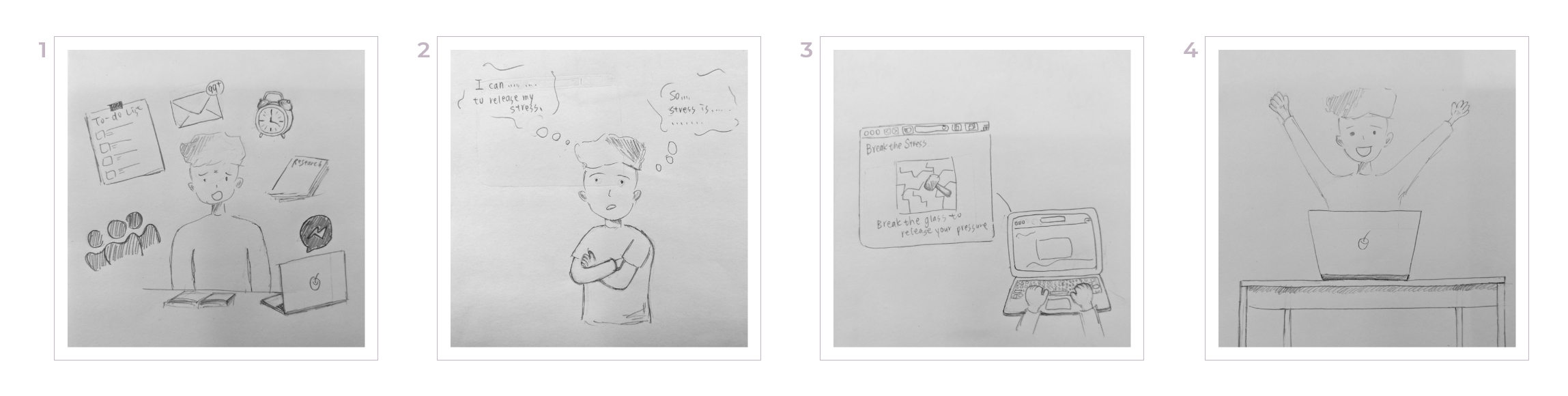
Storyboard (current)
This storyboard shows how our target users look for a solution to their pain points. Jim was stressed out while working on the computer. He started searching for a possible way to reduce his stress. After the bothering seeking process, he played a one-button game and felt okay to keep working on the computer.
User Journey Map
This user journey map points out Anna and Jim's every step and experience accordingly in the process. Derived from the map, we understand more about their goals/needs and see our opportunities as designers as well.
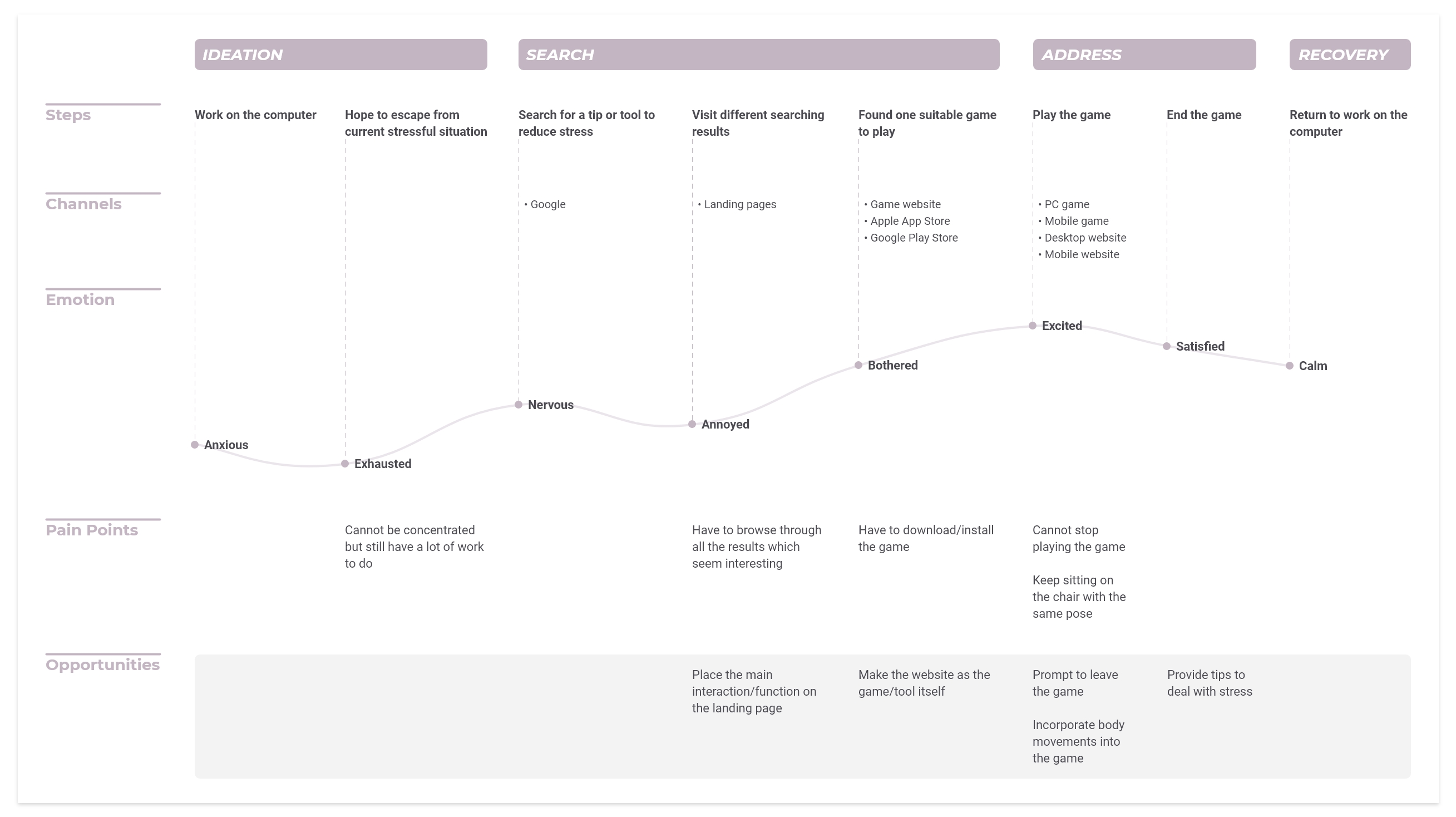
Opportunities & Design Questions
“How might we utilize the devices that users work on the most or already own?”
“How might we get users to start playing the game/using the tool as soon as they found it?”
Based on the personas, we realized that Anna and Jim worked on computers much more often than tablets and mobile phones. According to the user journey map, we found that websites as the tool or game itself were the most efficient way for them to start playing. Therefore, we decided to utilize a desktop website as the start point of the journey of our project.
Competitive Analysis & Inspirations
Pros
- Using cute illustrations with a quiet visual style to communicate a serious issue makes it more approachable for people.
- Simple and adorable character animations enhance people's curiosity to know more about Depression.
Cons
- Because the theme of the site is about illness, although it utilizes cute illustrations and animations, it does not provide direct stress-relieving elements.
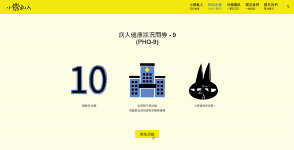
Depressy Trouble
![]()
Depressy Trouble is a website talking about Depression created by two Taiwanese designers. Besides professional information about Depression reviewed by experts, it also provides PHQ-9 (Patient Health Questionnaire-9) with interactive motions for users to evaluate their mental conditions.
![]()
Across the website, the designers turn Depression into a character and introduce causes, symptoms, treatments of Depression, and suggestions of how people can interact with patients with Depression through storytelling based around the character.
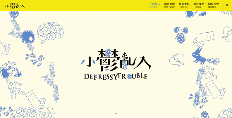
Depressy Trouble is a website talking about Depression created by two Taiwanese designers. Besides professional information about Depression reviewed by experts, it also provides PHQ-9 (Patient Health Questionnaire-9) with interactive motions for users to evaluate their mental conditions.
Pros
- The motions are elegant and smooth, which brings peace to users' minds.
- The music on the site builds an atmosphere of relaxing and increases users' engagement.
- There is a pinch of customization where users have their unique location stamps on their planes.
- Using the technique of dynamic serving setting makes it easy to share with people and decreases the friction of downloading a new app on different devices.
Cons
- The customization options are more like randomization of styles of the stamp based on users' current locations. Users cannot actively customize their planes.
- Users need to have a phone to fully experience the site because there is no interaction that users can play with on the desktop site.
Paper Planes World
![]()
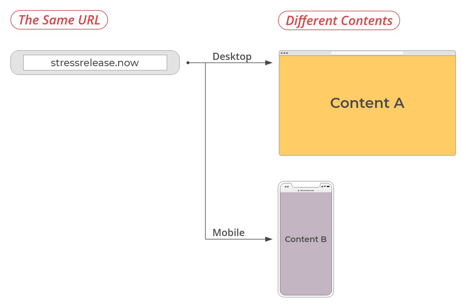
Paper Planes World is an interactive website digitalizing paper planes with elegant 3D motion. It is a dynamic serving web app meaning users see different contents when they enter the same URL on different devices.
![]()
![]()
On the desktop site, users see paper planes from different corners in the world and newly-joined planes. On the other hand, users catch and throw paper planes on their phones.

Paper Planes World is an interactive website digitalizing paper planes with elegant 3D motion. It is a dynamic serving web app meaning users see different contents when they enter the same URL on different devices.


On the desktop site, users see paper planes from different corners in the world and newly-joined planes. On the other hand, users catch and throw paper planes on their phones.
Pros
- The catalog feature builds a community that makes the creating experience supportive.
- The way of interaction is simple and easy to acquire.
- The motion of dropping sand along with the dropping sound effect increases users' engagement.
Cons
- Users need to spend time installing an app on their phones to interact with the experience on the go.
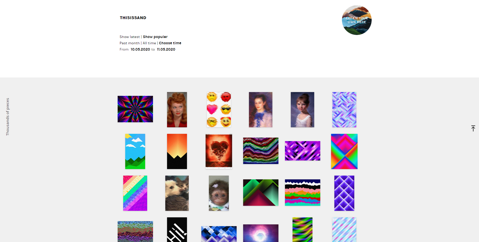
Thisissand
![]()
At Thisissand, users can create sandscapes with customizable sand colors and intuitive interactions through their desktop website or mobile apps.
![]()

At Thisissand, users can create sandscapes with customizable sand colors and intuitive interactions through their desktop website or mobile apps.
Pros
- The game mechanism is easy to understand.
- The interaction with the game context of destroying a physical item is very relieving and satisfying.
Cons
- The interaction is mono and becomes boring after a minute of playing.
- This game does not have a host URL, so while users are playing the game, there are always distractions around the game frame on the screen.
PC Breakdown
![]()
PC Breakdown is a one-button game that allows users to punch and destroy a computer virtually.
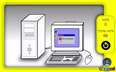
PC Breakdown is a one-button game that allows users to punch and destroy a computer virtually.
Our Takeaways from Competitive Analysis & Inspirations
After carefully case-studied each inspiration above, we listed some features that we might want to apply to our project:
-
Create playful interactions that easy for users to start experiencing.
- Use smooth motions to engage the users in the story that creators want to tell.
-
Add to-the-point sound effects or music for the interactions or motions to build a more immersive environment.
-
Besides main playful interactions, provide educational information or communities where users can share their experiences, thoughts, and feelings.
Ideate:
Key Messages & Takeaways for Audience
︎︎︎ Shift the state of mind away from stress
Our main goal of the project is to utilize a desktop website to get users out of a stressful situation and reduce anxiety.
︎︎︎
Bring a sense of satisfaction
Found on our competitive analysis, we decided to focus on task-oriented games with soothing motions and intuitive interactions for users to get a sense of achievement and satisfaction.
︎︎︎ Encourage physical movement & smile
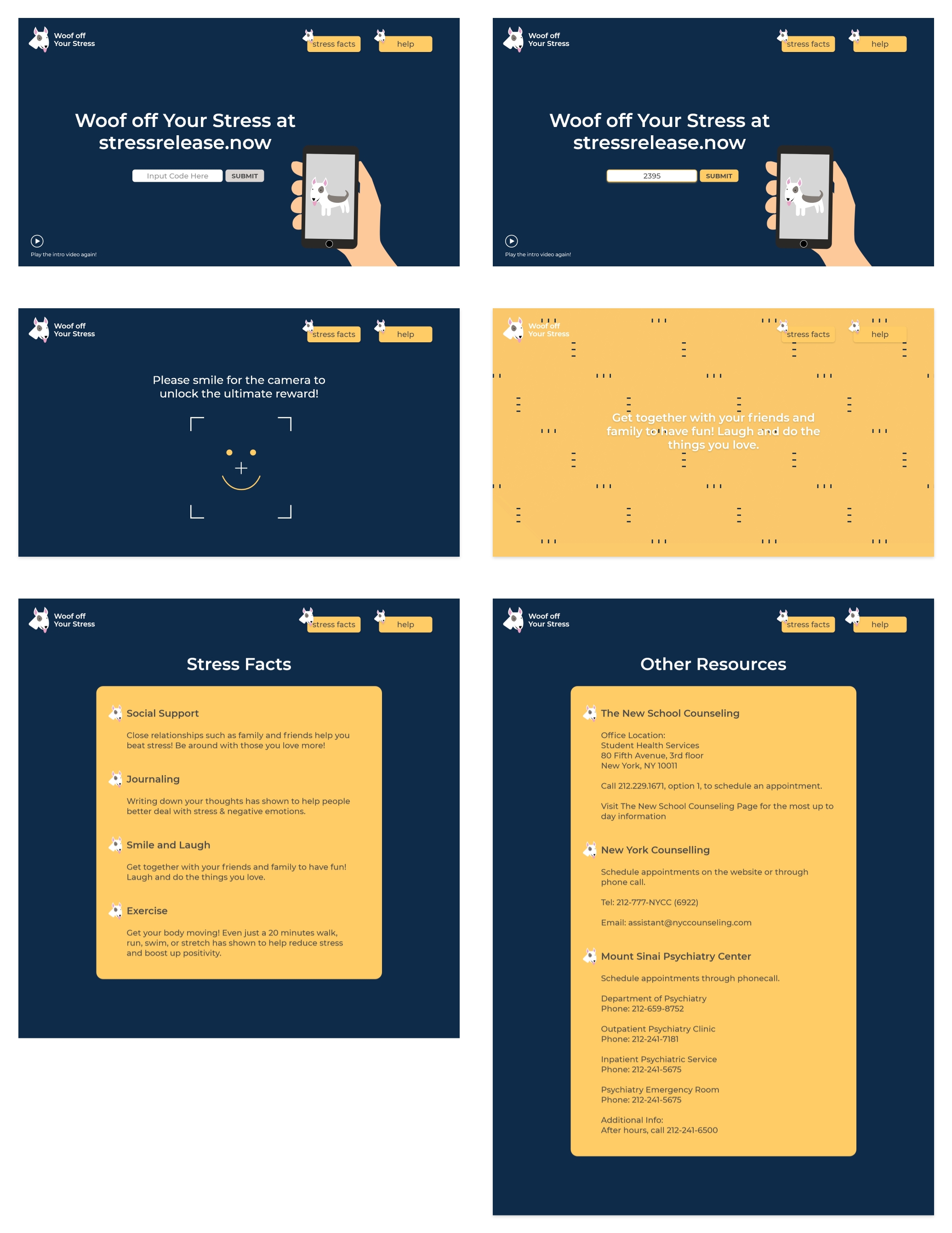
Based on our survey, our target audience usually sits at the computer and keeps the same pose for a long time. Thus, we want our users to leave their chairs or have body movements with prompts for them to go back to work.
According to research, a smiley facial expression can induce the mood it portrays, so we take advantage of a smile recognition to encourage users to smile before presenting the final reward to them.
︎︎︎ Build mindfulness towards stress
Besides diverting users' attention from the current condition, we also want to provide knowledge for them to understand how to manage their stress in the future.
Task Inspirations
While we collected several relaxation techniques to reduce stress, we ended up applying exercise, social support, journaling, and smile and laugh to our project.
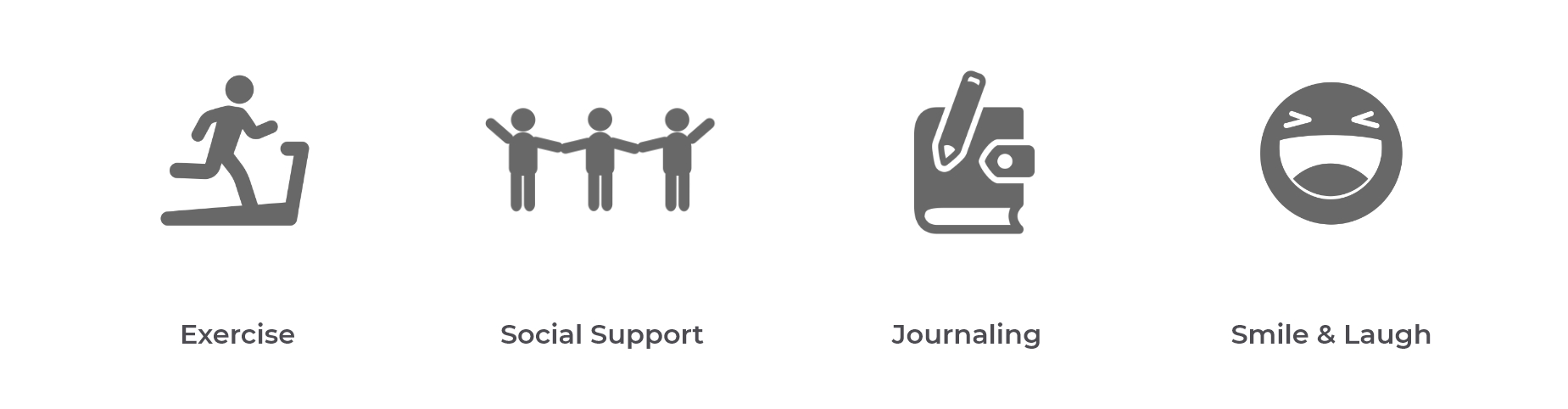
︎︎︎ Exercise
It has shown that all forms of exercise, even walking, can decrease stress and anxiety by stimulating the brain to release feel-good chemicals.
︎︎︎ Social Support
Sharing what's going on with our social network can get us a fresh perspective and help us handle stress while strengthening your connection.
︎︎︎
Journaling
Journaling can help us facilitate problem-solving and therefore reduce the stress and negative emotions by organizing our thoughts. Besides, either physically or virtually throwing those thoughts away makes it easier for us to not think about them.
︎︎︎ Smile & Laugh
Based on previous research, a facial expression of smiling help our mood by boosting brain chemicals.
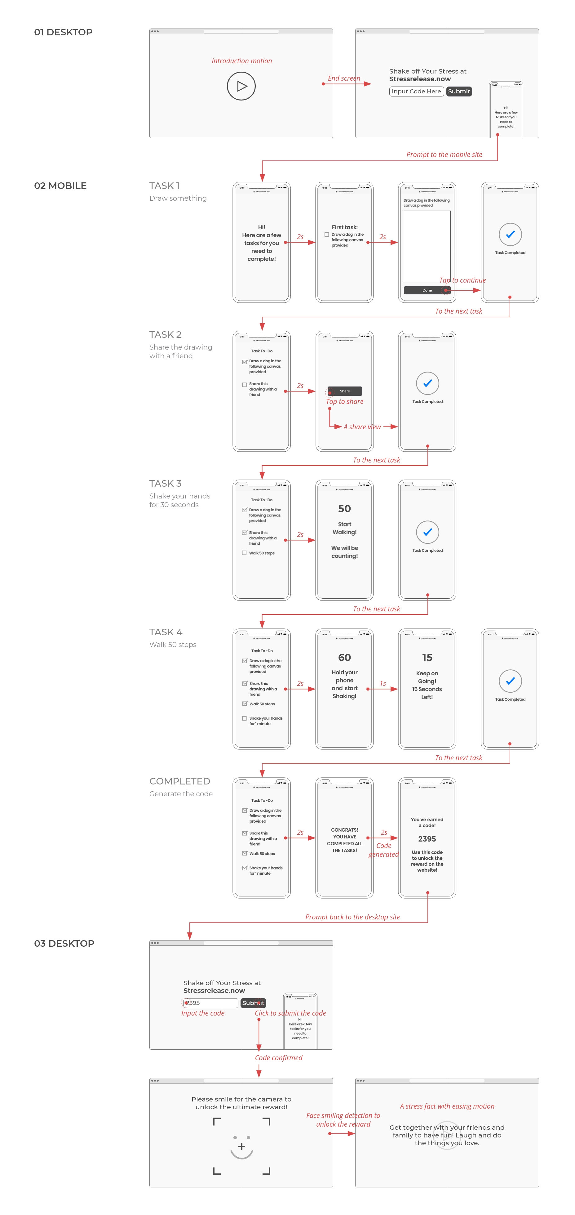
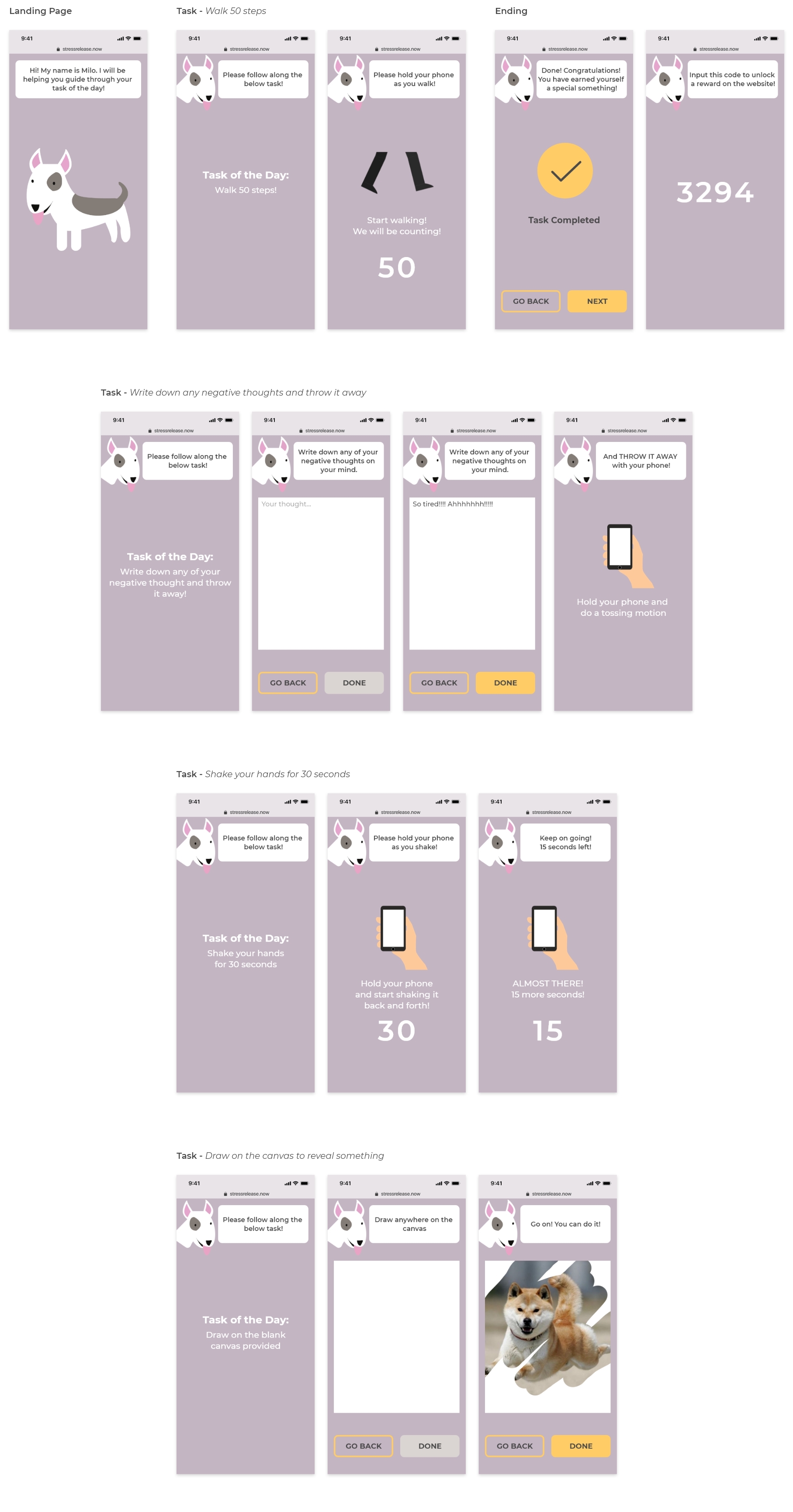
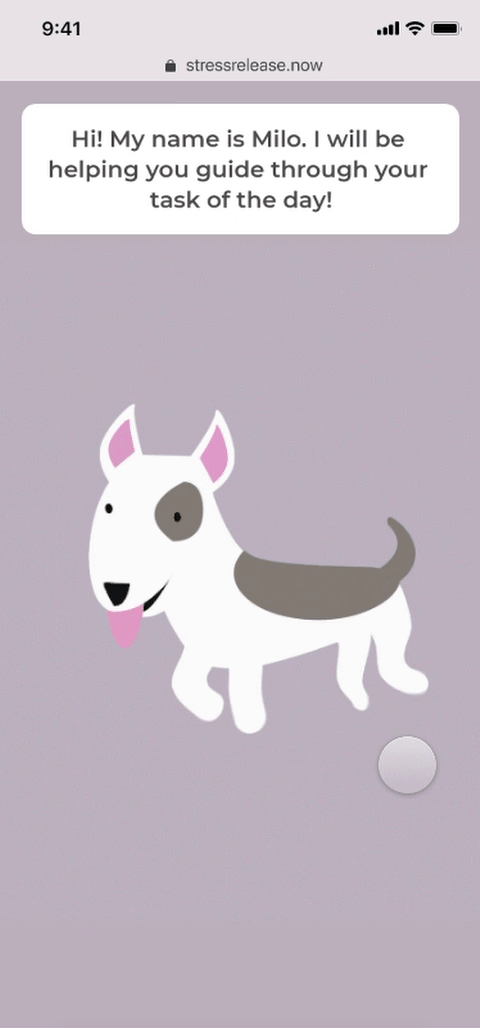
A Series of Tasks on Mobile
Users have to finish a series of tasks to generate the code to unlock the final reward.
- Draw something
-
Share the drawing with a friend
-
Shake your hands for 1 minute
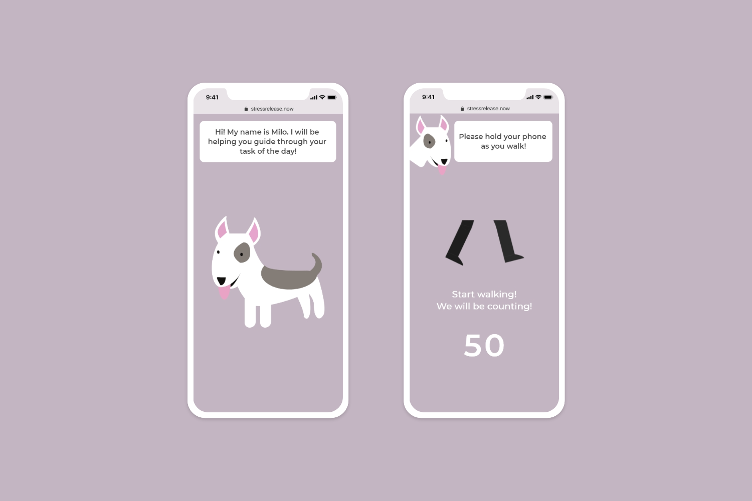
- Walk 50 steps
Storyboard (planned)

Prototype:
Dynamic Serving Web App
Information Architecture (IA)
︎︎︎ Flowchart (click here to view)
︎︎︎ Sitemap (click here to view)
︎︎︎ Wireflow
Wireflow
Lo-Fi Prototype
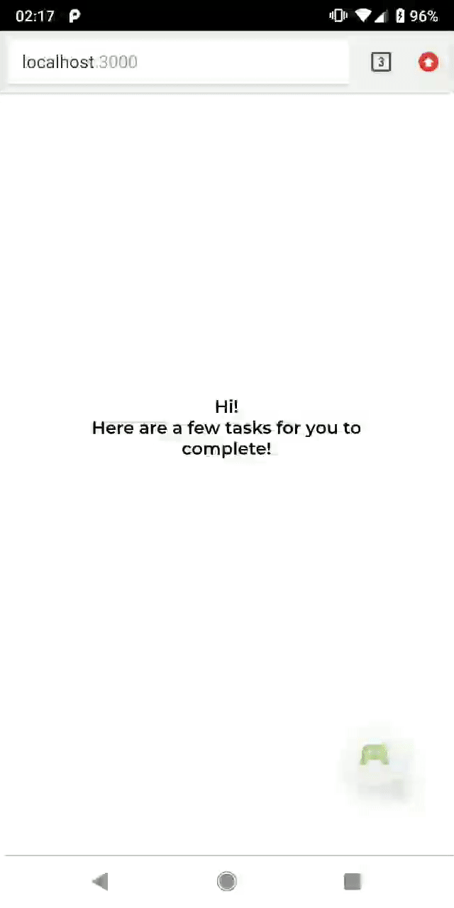
Mobile - technical prototype
(created by Anny Chang)
Desktop - intro motion
(created by Lisa Ho)
![]()
(created by Lisa Ho)
Desktop - reward motions
(created by Seong Jin Park)
![]()
![]()
![]()
![]()
(created by Seong Jin Park)


Iterate:
Feedback on the User Flow
We got feedback that while no clues were showing there would be four tasks in a row, it made users impatient after they finished the second/third mission and saw there were more tasks to do. Based on the feedback, we redesigned and decided that users would only have to complete one randomly assigned task at once to receive the code when they entered the mobile site.
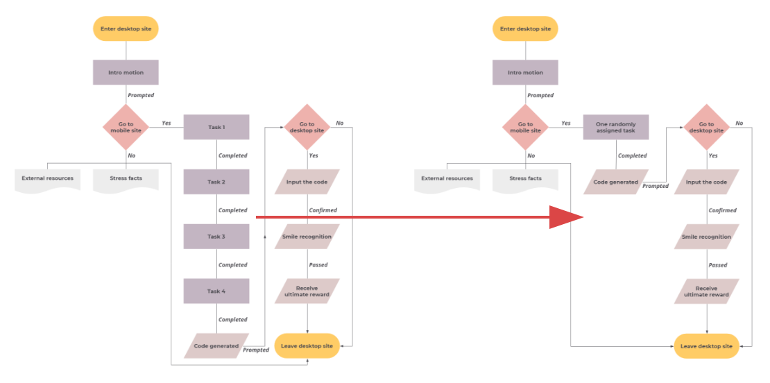
(Click to view the updated flowchart)
New tasks:
-
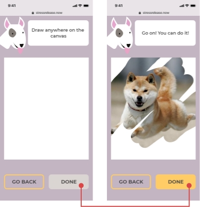
Draw on the canvas to reveal something
-
Write down any negative thoughts and throw it away
-
Shake your hands for 30 seconds
-
Walk 50 steps
Insights for the Four Tasks on Mobile
︎︎︎ People felt anxious about drawing freeform.
︎︎︎ Sharing needed context.
From Lo-Fi to Hi-Fi
-
Polished the intro motion with smooth transitions (by Lisa Ho)
-
Designed hi-fi UI screens built on the new user flow and wireframes
(by Lisa Ho & Anny Chang)
-
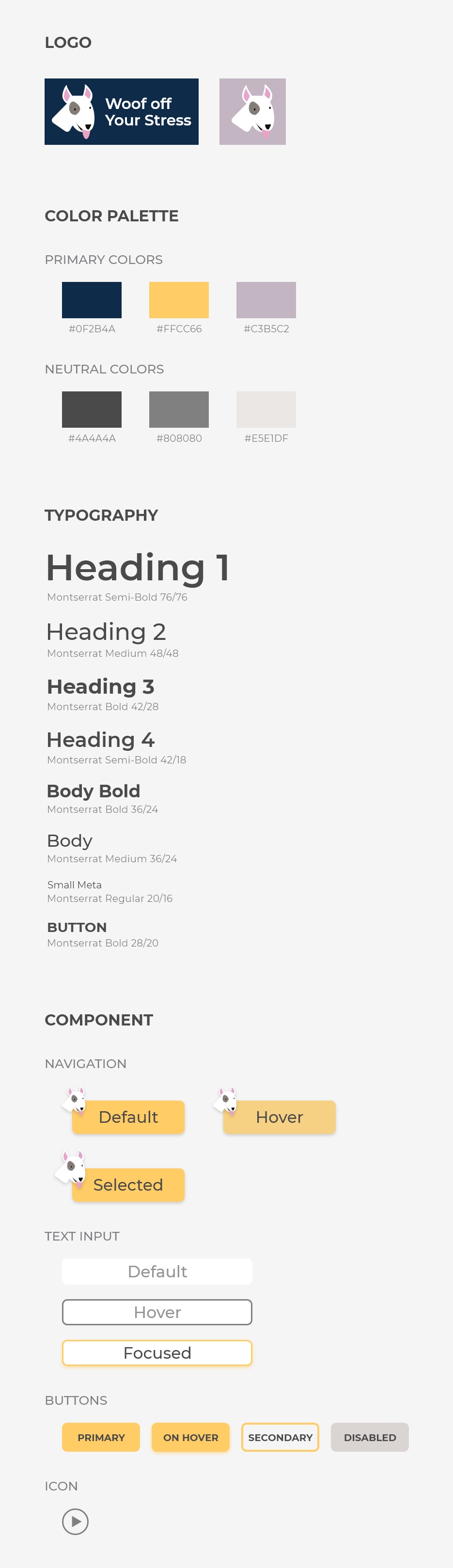
Created a design system based on the color palette and illustrations with rounded corners on the buttons and input fields to add softness to the user interface
-
Added desktop screens and final rewards to a technical prototype, so it presented the whole user flow except the face recognition feature
-
Styled the tech prototype based on the design system and hi-fi UI screens
-
Produced the reward motions with the right format and size for implementation (by Seong Jin Park)
Desktop Screens
Mobile Screens
Interaction Design Highlights
︎︎︎ Before users finish the assigned task, the "Done" button is disabled.

︎︎︎ Before users input code, the "Submit" button is disabled.

︎︎︎ Users will feel a vibration as a hint of successfully throwing their negative thoughts away.

︎︎︎ We use different texts during the countdown to encourage users to keep doing it.
Design System
I created a design system for the website to create reusable components to increase the efficiency of building new pages in the future. Also, a design system makes it easier to maintain consistent experiences both visually and functionally for our site across platforms from mobile to desktop.
Present:
Hi-Fi Prototype
(created in Adobe XD & ProtoPie)


Tech Prototype Demo Video
(created with HTML, CSS, JavaScript, jQuery & Node.js)Future Iterations
For future iterations, we would like to incorporate the existing function such as smile recognition or other interactive elements to make the final reward more personalized to attract users to keep using our website. Besides, we would like to develop more different tasks to increase users' interest.
Learnings
This project has proven it again that having thorough research made it easier to execute the next steps in the process. Based on what we found from the research phase, we decided that we would like our project to focus more on diverting users' attention than relieving their stress and anxiety. Therefore, by keeping this goal in our minds, we were able to utilize our users' easy access toward their desktops and mobiles.
We also learned from the usability testings that we might usually overestimate users' patience for completing the whole user journey we designed at first. Therefore, it yielded the importance of bringing in usability testings in a relatively early stage to have an outcome with the best user experience.
As a UX designer and developer in a cross-functional team, it was a challenge and recognizable progress for me to find a balance between my two roles, and to communicate with my team members about the details of the interaction design and the restrictions for the technical prototype.
*Character illustration in all the pictures except app screens on this page is originally designed by pikisuperstar / Freepik.