
Seamless
︎︎︎ mobile app redesign (unsolicited)
︎︎︎ design sprint
︎︎︎ UX case study
︎︎︎ design sprint
︎︎︎ UX case study
Optimized the ordering experience with the delivery service in the Seamless app within a 5-day design sprint

Role
︎︎︎ product designer
︎︎︎ product designer
Time
︎︎︎ June 2020
︎︎︎ 5-day design sprint
︎︎︎ June 2020
︎︎︎ 5-day design sprint
Tools
︎︎︎ Figma
︎︎︎ Figma Mirror
︎︎︎ Figma
︎︎︎ Figma Mirror
Discipline
︎︎︎ digital product design
︎︎︎ digital product design
Why
Living in a fast-paced life in NYC, I enjoy using a food delivery service a lot. I've used different platforms, including Seamless, UberEATS, Postmates, and DoorDash. Among these platforms, I've been using Seamless the most around 2-3 times a week. During my experience using Seamless over one year, I always think it would be better if the app could have other navigation features for restaurant menus. Therefore, I decided to do this side project redesigning the ordering experience with the delivery service.
Seamless has options for delivery and pickup. For this redesign, I was focused on the delivery service because I've only used the delivery service and also wanted to narrow down the scope of the project. Furthermore, this was an unsolicited redesign project completed by myself to get more proficient at each step of the end-to-end design process of refactoring/iterating existing features of a product.
Seamless has options for delivery and pickup. For this redesign, I was focused on the delivery service because I've only used the delivery service and also wanted to narrow down the scope of the project. Furthermore, this was an unsolicited redesign project completed by myself to get more proficient at each step of the end-to-end design process of refactoring/iterating existing features of a product.
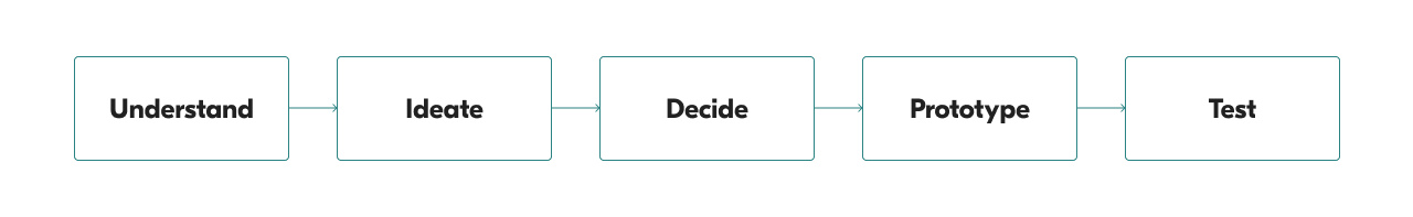
5-day Design Sprint Process
Process
To complete this project, I decided to use this 5-day design sprint method, which asks designers and other team members to be involved in a project for five full days with a different mission each day. The five phases for these five days include understand, ideate, decide, prototype, and test. I settled down on this framework for this project so I could challenge myself to iterate the design and validate the design decisions in a very compressed time frame.
Two references I read about how to execute a design sprint before I started:
︎︎︎ A Comprehensive Guide to Running Design Sprints
︎︎︎ What’s a Design Sprint and why is it important?
Two references I read about how to execute a design sprint before I started:
︎︎︎ A Comprehensive Guide to Running Design Sprints
︎︎︎ What’s a Design Sprint and why is it important?
Long-term Vision
While doing this project, I assumed I had been a product designer in the Seamless product team, so I set a long-term question which the product would have to answer in the future before I started the sprint.
“Will it take less effort for users to find what they want to order with the delivery service?”
Constraints
For this redesign project, I had to make use of the current data, design system, and UX language, which the Seamless app was using pretending this was a design sprint at Seamless to refactor the design without revamping everything to solve some UX problems.
Research & Design Methods
︎︎︎
Journey mapping
︎︎︎ User interview
︎︎︎ Task analysis
︎︎︎ Card sorting
︎︎︎ Requirements & constraints gathering
︎︎︎ Competitive analysis
︎︎︎ Brainstorming (Crazy 8's)
︎︎︎ User story
︎︎︎ Prototyping
︎︎︎ Prototype testing & feedback
︎︎︎ Feedback review
︎︎︎ User interview
︎︎︎ Task analysis
︎︎︎ Card sorting
︎︎︎ Requirements & constraints gathering
︎︎︎ Competitive analysis
︎︎︎ Brainstorming (Crazy 8's)
︎︎︎ User story
︎︎︎ Prototyping
︎︎︎ Prototype testing & feedback
︎︎︎ Feedback review
Day 1: Understand
On day 1, after setting up the user goal, I mapped out the user journey of ordering with the delivery service on the seamless app and then interviewed five users to get more insights from users' perspective. Based on the interviews, I created an empathy map and combined it with the user journey map to find out the opportunities. Then, I converted these opportunities into a list of "how might we" questions* and chose two target events from the user journey for this project.
(*These were supposed to be "how might I" questions in this context since I was doing it alone, but in the UX industry, "how might we" has become a common phrase for designers to talk about design opportunities. Therefore, I would use HMW in the following paragraphs.)
(*These were supposed to be "how might I" questions in this context since I was doing it alone, but in the UX industry, "how might we" has become a common phrase for designers to talk about design opportunities. Therefore, I would use HMW in the following paragraphs.)
User Journey Map

User journey map (pink notes)
To start mapping out the user journey, I decided that the end goal of this journey was to get something to eat as soon as possible with the delivery service. After setting up the end goal, I wrote down each step on a sticky note, pasted them on the wall, and organized them with arrows to point out the exact flow.
At the beginning of this flow, a user could type a keyword in the search bar, use the default cuisine category list, or look at the default restaurant feed with the sorting system to find out the fastest-delivered options. Once a user picked a restaurant, they would land on the restaurant's menu. On the menu page, a user could scroll and browse through the whole menu, type a keyword to search for a specific item or jump to a category section by choosing from the category list. Then, a user could add items to the car, check out the order, and wait for the food to be delivered.
User Interviews
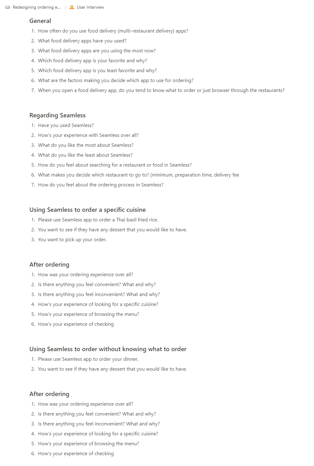
Based on the user journey map above, I listed out questions about a user's experience using the delivery service with mobile apps in general and with the Seamless app specifically.
Besides questions, I also asked users to finish two ordering tasks. One was to order a specific cuisine and then order a dessert from the same restaurant to see how users search for what they want and get them to the menu browsing experience. The other was to order dinner without knowing what to order to see how users navigate the app to find something they want to order. After either of the tasks, I asked users their experience of completing the task. I ended up interviewing five users who were also New Yorkers in total.
︎︎︎ User interview script
Empathy Map
After conducting the interviews, I organized the users' answers into the four categories on an empathy map: say, think, feel, and do.
![]() Empathy map with answers from the user interviews
Empathy map with answers from the user interviews
Here are some examples of what users say/think/do/feel when they were using the Seamless app:
 Empathy map with answers from the user interviews
Here are some examples of what users say/think/do/feel when they were using the Seamless app:
👄 Say
-
How can I get a pizza in 30 minutes?
-
I want to know the dessert options of this restaurant.
- I want to order again from one of the restaurants I've ordered.
📱
Do
- Check how long it takes to deliver to my place.
- Browse through the whole menu to know what this restaurant serves.
- Look for restaurants with coupons.
💭️ Think
- I'm not sure how relevant these search results are to the keyword I typed in.
- None of these restaurant options look interesting to me.
- It took me a while to scroll to the dessert section.
- I like it shows me what I've ordered from this restaurant before.
🧡 Feel
-
Excited - can't wait for the meal
-
Overwhelmed - the menu is endless. hard to remember all the categories this menu has
-
Frustrated - hard to find the food raises my appetite from the thumbnails
- Impatient - I remember I saw the pineapple fried rice option, but I can't find it now
Swim Lane Diagram
I wrote down each item from each category on the empathy map onto a sticky note in different colors. Then, I put them underneath a corresponding step on the user journey map to see where the most comments and concerns are from the ordering experience on the Seamless mobile app. Last, I drew sad faces on the notes expressing negative emotions or thoughts. Based on the swim lane diagram, I learned that most of the users' answers were around the browsing step either for restaurant options or menu items.
![]()

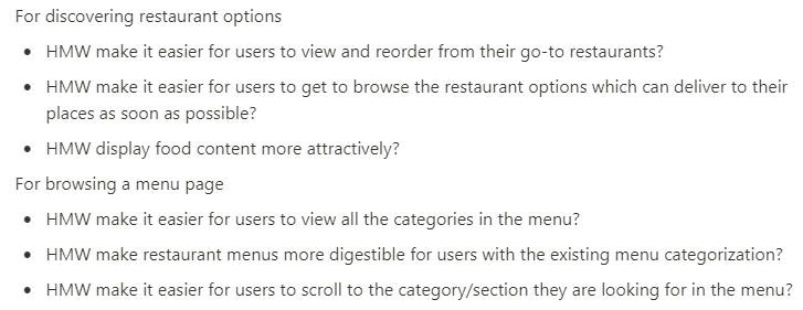
How Might We...
From the swim lane diagram, I found out that most comments went to the browsing step for restaurant options and restaurant menus. I made the thoughts around these two big groups into smaller groups by putting together the notes with similar opinions or feelings and created a how might we question on a blue sticky note for each subgroup.
![]() Subgroups with HMW questions (blue notes)
Subgroups with HMW questions (blue notes)
Then, I picked out the questions with more users' feedback around:
 Subgroups with HMW questions (blue notes)
 Then, I picked out the questions with more users' feedback around:
For discovering restaurant options
- HMW make it easier for users to view and reorder from their go-to restaurants?
- HMW make it easier for users to get to browse the restaurant options which can deliver to their places as soon as possible?
- HMW display food content more attractively?
For browsing a menu page
- HMW make it easier for users to view all the categories in the menu?
- HMW make restaurant menus more digestible for users with the existing menu categorization?
- HMW make it easier for users to scroll to the category/section they are looking for in the menu?
Target Events
Based on the opportunities I learned from the user research, I decided to target at these two events to redesign around:
- Discover restaurant options
- Browse a menu page
Day 2: Ideate
On day 2, I did a lightning demos to look at some of the competitive apps to get some inspirations. Then, I conducted a four-step sketch method to ideate for the opportunities I learned from earlier.
Lightning Demos
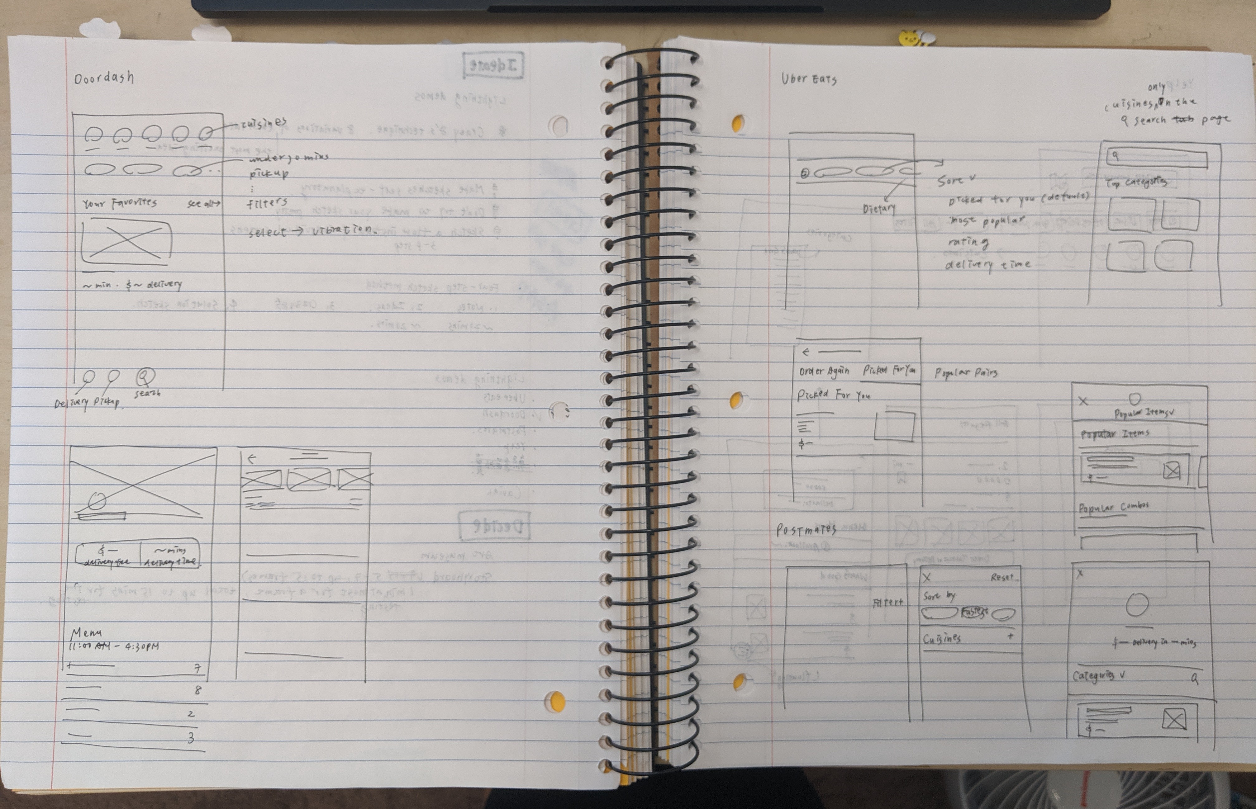
I did a quick competitive analysis on Doordash, UberEats, Postmates, and Yelp. I drew down the part of the user interfaces and interactions that I felt inspired or related to the target events of this project.
While doing research, I found out that most of them used a chip system to display their filtering feature, which made them one less step to apply the filters than the one on the Seamless app. Some of them also showed multiple pictures as thumbnails for each restaurant on the restaurant list.
While doing research, I found out that most of them used a chip system to display their filtering feature, which made them one less step to apply the filters than the one on the Seamless app. Some of them also showed multiple pictures as thumbnails for each restaurant on the restaurant list.

Four-step Sketch Method
1️⃣ Notes
I reviewed my research from day 1 and organized the findings into notes.
![]() Notes(left) and ideas(right)
Notes(left) and ideas(right)
2️⃣ Ideas
Based on the notes, I spent 20 minutes sketching out some big ideas popping out from my mind. I wanted to utilize the chip system better with the filter system for the restaurant searching feature. I also wanted to apply the chip system to the menu pages.
3️⃣ Crazy 8’s
I used the Crazy 8's technique spending 8 minutes to sketch out eight different variations for the ideas I got from the last step for either of the two target events from day 1.
![]() Crazy 8's for discovering restaurant options (target event 1)
Crazy 8's for discovering restaurant options (target event 1)
![]() Crazy 8's for browsing a menu page (target event 2)
Crazy 8's for browsing a menu page (target event 2)
4️⃣ Solution Sketch
I pushed this final step to day 3, so I could have a more fresh eye to decide which solution to go to and sketch it out.
I reviewed my research from day 1 and organized the findings into notes.
 Notes(left) and ideas(right)
2️⃣ Ideas
Based on the notes, I spent 20 minutes sketching out some big ideas popping out from my mind. I wanted to utilize the chip system better with the filter system for the restaurant searching feature. I also wanted to apply the chip system to the menu pages.
3️⃣ Crazy 8’s
I used the Crazy 8's technique spending 8 minutes to sketch out eight different variations for the ideas I got from the last step for either of the two target events from day 1.
 Crazy 8's for discovering restaurant options (target event 1)
 Crazy 8's for browsing a menu page (target event 2)
4️⃣ Solution Sketch
I pushed this final step to day 3, so I could have a more fresh eye to decide which solution to go to and sketch it out.
Day 3: Decide
Starting from the last step in the 4-step sketch method from day 2, I got a fresh eye to look at all the ideas from my sketches. I decided on the solution for either target event to answer the "how might we" questions from day 1. After sketching out the detailed screens for the solutions, I drew a storyboard based on the user journey map I created on day 1 and the solution.
Solution Sketch
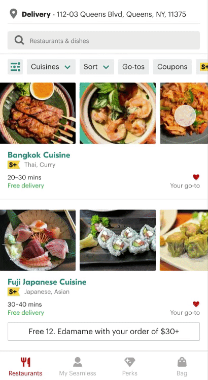
For the restaurant list, I wanted to put more pictures from a restaurant's menu as thumbnails to let people have more sense of what dishes it served and increase users' interests in it. By incorporating the current chip design with the filter system, it could be more convenient for users to apply and modify filters.
![]()
For a restaurant's menu, I wanted to utilize current chip design with the menu category list so that users could feel more accessible to look at the category that they had more interest in or were finding. Besides, adding a button called "categories" on the menu page could make it easier for users to have a glance at all the categories in the menu.

For a restaurant's menu, I wanted to utilize current chip design with the menu category list so that users could feel more accessible to look at the category that they had more interest in or were finding. Besides, adding a button called "categories" on the menu page could make it easier for users to have a glance at all the categories in the menu.
Storyboard
This storyboard had to include a user's experience from the very beginning to the end of the user journey map I created on day 1.
It was 6:15 pm and raining outside. A user felt hungry and wanted to order a burger, some fries, and chickens. He typed in "fried chicken" in the search bar and sorted the results with "delivery estimate" to find out the fastest options he could get. He found one restaurant that caught his attention and browsed the menu. He added "fried chicken" to the cart.
Then, he felt he also wanted to get some dessert, so he used the chip system at the top to jump to the dessert section in the menu. He added a slice of cheesecake to the cart and checked out the order at 6:20 pm. Finally, he got his food delivered and started enjoying his meal at 6:55 pm.
Then, he felt he also wanted to get some dessert, so he used the chip system at the top to jump to the dessert section in the menu. He added a slice of cheesecake to the cart and checked out the order at 6:20 pm. Finally, he got his food delivered and started enjoying his meal at 6:55 pm.

Day 4: Prototype
To make a prototype as realistic as possible, I decided to create mockups and prototype them both in Figma and display the prototype with Figma Mirror on my phone to do the user testings. For this project, I wanted to utilize some of the components and writing that the Seamless app was already using, so I spent some time researching the current Seamless design system by looking carefully at the mobile app and website.
Before I started designing mockups in Figma, I also collected assets like pictures and some screenshots from the app and website. After I finished the prototype, I wrote the interview script with the task plan for the user testing on day 5.
Before I started designing mockups in Figma, I also collected assets like pictures and some screenshots from the app and website. After I finished the prototype, I wrote the interview script with the task plan for the user testing on day 5.
To Discover Restaurant Options
(left: old, right: new)
![]()

1️⃣
I combined the refine button with the original chip design into a new filter chip system. In the current app, users tapped the refine button, adjusted the filters, and saw the results with filters applied after hitting the update button. However, in my design, users could easily have a glance at all the filter options by horizontally scrolling the chips without jumping to a different page. Also, applied filters would change into the green background with bolder and white text, so it became clear what filters had applied to the restaurant feed currently.
2️⃣
Users could still use this button to open the original refine page, and the light green dot on the top right corner indicated there were filters applied to the current restaurant feed.
3️⃣
I separated each filter option into different chips utilizing the existing overlay design component.
I separated each filter option into different chips utilizing the existing overlay design component.
(left two: old)

4️⃣
I also applied the overlay design to the cuisine options opened by tapping the cuisines button so users could have a consistent experience while using filter chips.
I also applied the overlay design to the cuisine options opened by tapping the cuisines button so users could have a consistent experience while using filter chips.

(left: old, right: new)
(left: old, right: new)
![]()

5️⃣
I researched the restaurant menus and found out each of them had a least four pictures on a menu page, so I decided to utilize those pictures in a restaurant option. Instead of a small thumbnail to guess what food this restaurant provided, in the new design, users could horizontally scroll to see four larger pictures of the food from each restaurant.
6️⃣
In the original design, coupons on the restaurant card looked a little bit off from all the other parts. Therefore, I added a frame to the coupon information and aligned it to the center, so it stood out more decently.
7️⃣
I changed the card design and, instead, used lines as dividers to separate each restaurant option on the feed so that each option had more space to display the pictures, coupons, and all the other information in a more spacious layout.
8️⃣
I added a little bit of roundness to the components to include the chips, pictures, and coupons, so it did not result in an overwhelming feeling with so much different information.
I added a little bit of roundness to the components to include the chips, pictures, and coupons, so it did not result in an overwhelming feeling with so much different information.

(left: old, right: new)
(left: old, right: new)
![]()

9️⃣
Because the filter chips and the food pictures are left-aligned, I made the "Matches" title and matched items into two lines so the matched item chips could be left-aligned as well. I also changed the font of matched items into the same font as restaurant titles so they could stand out more.
Before, there were no dividers between two restaurant options, so the grouping of a restaurant and its matching items was clear. Therefore, the divider I designed for a restaurant option layout also helped group the information of a restaurant option.
To Browse a Menu Page
1️⃣
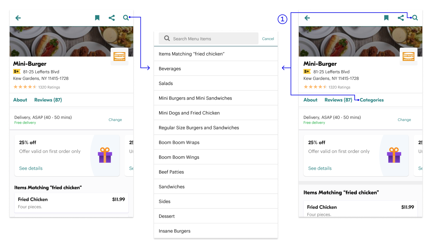
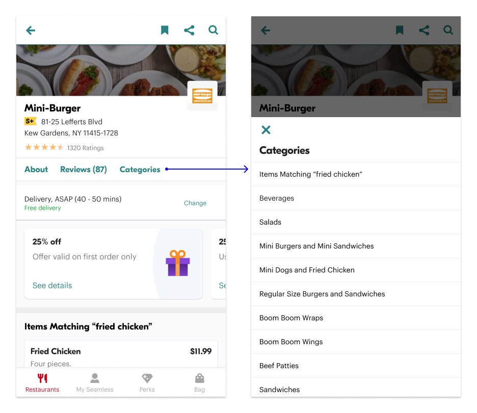
In the original design, the category list was in the search function, and this had made it very hard to find. Therefore, I added the "Categories" tab next to the review tab, so it would be straightforward for those users who would like to see all the categories on the menu.
(left and middle: old, right: new)
2️⃣
When a user started scrolling a menu page, these category chips would show up, and the one corresponding to the section on the top of the current view would become white and bold with green background as being highlighted. Users could also tap on a category chip to jump to the corresponding section on the menu so that they did not have to go to the category section by scrolling and felt lost in the page.


(left: old, right: new)
3️⃣
The new category chip system replaced the original sticky header design as the new header for each section on the menu.
4️⃣
I enlarged the title of each section, so the hierarchy between the title of each category section and the food items was more noticeable, which also increased readability.
The new category chip system replaced the original sticky header design as the new header for each section on the menu.
4️⃣
I enlarged the title of each section, so the hierarchy between the title of each category section and the food items was more noticeable, which also increased readability.
User Testing Script
After designing the basic UI screens with the new design solutions, I created more UI screens and interactive prototypes based on my testing plan for day 5. I wrote down the script of the order and the instructions for tasks I wanted to test and interview questions about users' experience of finishing the tasks.
Day 5: Test
According to the user testing script I wrote on day 4, I did testing with a user. I observed how the user interacted with the prototype and asked her experience of using the new features. I also showed her the original filter system and layout next to the new ones I designed to ask her opinions of the original ones and new ones. After testing the new design, I updated some of the designs I had made based on the feedback.
Feedback
︎︎︎ Restaurant Feed Filter Chips
The user thought the original refine button was clear enough with text on the button. However, she liked the chip design better because she could have one less click to see all the available filter options. Also, the applied filter chips turning green was recognizable for her to know what filters were in use.
︎︎︎ Restaurant Option Layout
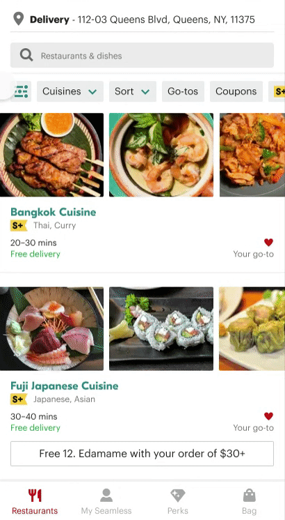
The user liked that she could see three pictures for each restaurant option even before she started scrolling because she would know these pictures were totally from the restaurant. For her, the original card design with only one picture made her feel the image would be fake, and the card was like an ad.
︎︎︎ Matching Item Chips
The user thought the original chips were more visible with the grey background.
︎︎︎ Menu Category Page
Though the "categories" button made it easier to see all of the categories but the user felt a little bit lost when the category page covered up the whole menu page. She was not sure of what might happen or where she would go if she tapped the cancel button.
︎︎︎ Menu Category Chips
The user thought it was easy to go to a specific section using the chips on the top. Although it wasn't that hard to remember what she has scrolled through on the menu page, it took less time for her to go to a particular section after browsing the whole menu.
︎︎︎ Category Title
She did not feel any differences between the original category titles and the new ones which I had enlarged a little bit.
︎︎︎ Overall Experience
To the user, there was nothing special, but the whole experience was quite smooth. She did not have to take time to learn how to use the prototypes with the new layout and interactions I designed because she thought the chip system was pretty similar to what she had experienced on the UberEats app.
The user thought the original refine button was clear enough with text on the button. However, she liked the chip design better because she could have one less click to see all the available filter options. Also, the applied filter chips turning green was recognizable for her to know what filters were in use.
︎︎︎ Restaurant Option Layout
The user liked that she could see three pictures for each restaurant option even before she started scrolling because she would know these pictures were totally from the restaurant. For her, the original card design with only one picture made her feel the image would be fake, and the card was like an ad.
︎︎︎ Matching Item Chips
The user thought the original chips were more visible with the grey background.
︎︎︎ Menu Category Page
Though the "categories" button made it easier to see all of the categories but the user felt a little bit lost when the category page covered up the whole menu page. She was not sure of what might happen or where she would go if she tapped the cancel button.
︎︎︎ Menu Category Chips
The user thought it was easy to go to a specific section using the chips on the top. Although it wasn't that hard to remember what she has scrolled through on the menu page, it took less time for her to go to a particular section after browsing the whole menu.
︎︎︎ Category Title
She did not feel any differences between the original category titles and the new ones which I had enlarged a little bit.
︎︎︎ Overall Experience
To the user, there was nothing special, but the whole experience was quite smooth. She did not have to take time to learn how to use the prototypes with the new layout and interactions I designed because she thought the chip system was pretty similar to what she had experienced on the UberEats app.
Iteration


︎︎︎ Matching Items Tag
According to the user feedback, the tags with grey background stood more out, so I kept the title as what I already redesigned and changed the background color of the "Matching Items" tags to grey.
According to the user feedback, the tags with grey background stood more out, so I kept the title as what I already redesigned and changed the background color of the "Matching Items" tags to grey.
︎︎︎
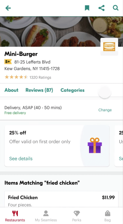
Menu Category Overlay
Instead of covering up the whole menu with a category page, I utilized the overlay design here to all the categories on the menu page, so users could know they were still on the menu page without feeling lost.
Instead of covering up the whole menu with a category page, I utilized the overlay design here to all the categories on the menu page, so users could know they were still on the menu page without feeling lost.

Final Prototype
Enter full screen (F) to play with the prototypes!
︎︎︎ Discover restaurant options
︎︎︎ Browse a menu page (The category chip system only works by tapping the screen in the prototype.)
︎︎︎ Discover restaurant options
︎︎︎ Browse a menu page (The category chip system only works by tapping the screen in the prototype.)
Feedback Review with the HMW Questions
Based on the user feedback, the redesigned filter chip system was more convenient to use compared to the original refine page with all the filter options hidden in one place. The redesigned layout for each restaurant option caught the user's eye more than the existing design and increased the user's confidence in the food quality and realness of the restaurant.
![]()
To browse the categories of a menu, it became relatively effortless with the new button and the overlay design. Besides, the category chip using the existing menu categorization made it more efficient to reach and view a specific section on the menu.
To browse the categories of a menu, it became relatively effortless with the new button and the overlay design. Besides, the category chip using the existing menu categorization made it more efficient to reach and view a specific section on the menu.
Learnings
First of all, to get users' real reactions, I should use more neutral words for the task instructions in the future. One of the assigned tasks in the testing was asking the user to find the go-to restaurants with the redesigned filter chips. I was using the exact UX language in the app, "go-to," which led the user to tap on the go-to button directly and biased the possible outcome.
I also got interesting feedback from the user, saying that she wondered if anyone would like to order from a one-star restaurant. This feedback inspired me that if I had the chance to see the analysis at backend about user behaviors, I would like to see how current users used the rating filter and then maybe redesigned it based on that.
After the lockdown situation due to the pandemic, I'd like to do 3 to 4 more user testings in person because I always consider users' behaviors of interacting with the product. I observe not only where they tap and how many times they tap on a particular button but also how their fingers wander around the screens. At this moment, I would have to seek out online user testing tools that I was not that familiar with before to get more user feedback and adapt to the future possibility of working from home most of the time.
Last but not least, I enjoyed doing this project, especially experiencing the end-to-end process of looking at the current flow, finding out the problems, brainstorming solutions, designing the UI and interactions with details, getting feedback from users, and iterating the design. Every day during this design sprint, I woke up being excited for the mission of the day, and it confirmed my passion for dedicating user experience with tech products again.