
Parsons DEED(Development through Empowerment, Entrepreneurship, and Design)
Lab
︎︎︎ website redesign
︎︎︎ UX case study
︎︎︎ UX case study
Redesigned the website to align with the visual style of the new logo and renovated it with modern UI/UX design language to improve user experience
︎︎︎ Visit Parsons DEED Lab website
︎︎︎ Visit Parsons DEED Lab website

Role
︎︎︎ UI/UX designer
︎︎︎ UI/UX designer
Time
︎︎︎ Jun. 2018 - May 2019
︎︎︎ Jun. 2018 - May 2019
Tools
︎︎︎ Adobe XD
︎︎︎ WordPress(Elementor)
︎︎︎ Adobe XD
︎︎︎ WordPress(Elementor)
Discipline
︎︎︎ responsive web design
︎︎︎ responsive web design
Collaborators
︎︎︎ worked with a researcher and the lab directior
︎︎︎ worked with a researcher and the lab directior
Project Overview
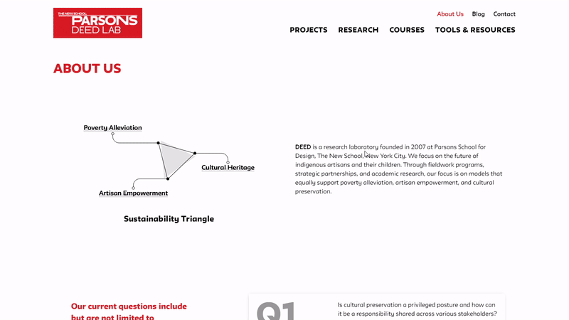
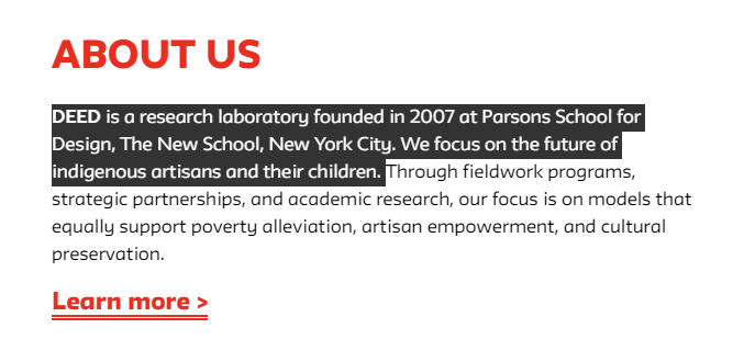
Parsons DEED Lab is a research laboratory founded in 2007 at Parsons School for Design, The New School, New York City. In 2018, the lab director planned to revamp the website and have a new logo that complied with the university's branding.
Process

Deliverables
︎︎︎ Usability assessment report
︎︎︎ Sitemap
︎︎︎ Wireframe
︎︎︎ Lo-Fi prototype
︎︎︎ Hi-Fi prototype
︎︎︎ Launched site
︎︎︎ Design system
Research & Insights:
Goals
- Redesign the website with updated content and a more modern style
- Adapt the website's branding to align with the new logo created by The New School marketing team
- Make information easier to process and digest for users
New Logo
(created by The New School marketing team)
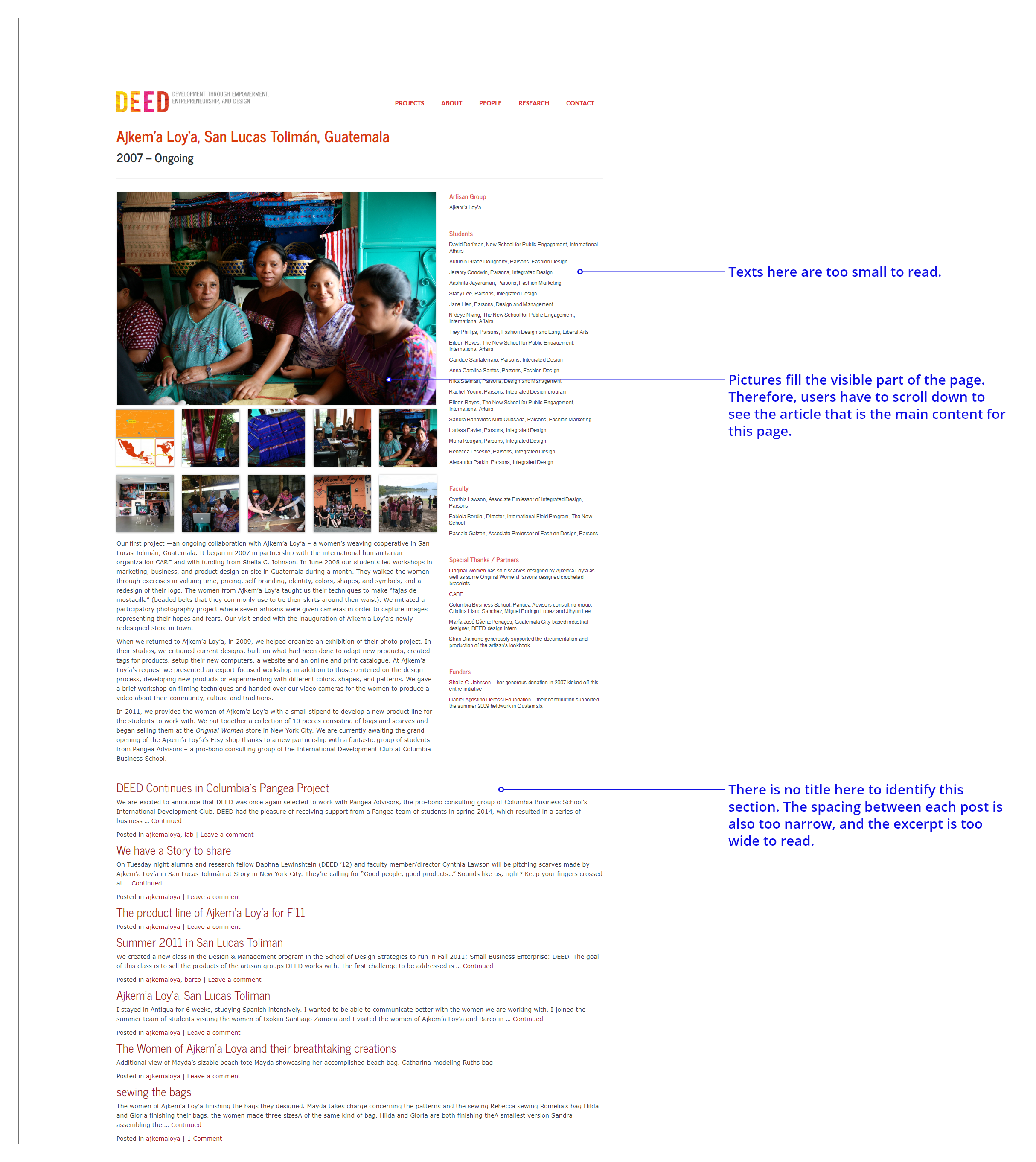
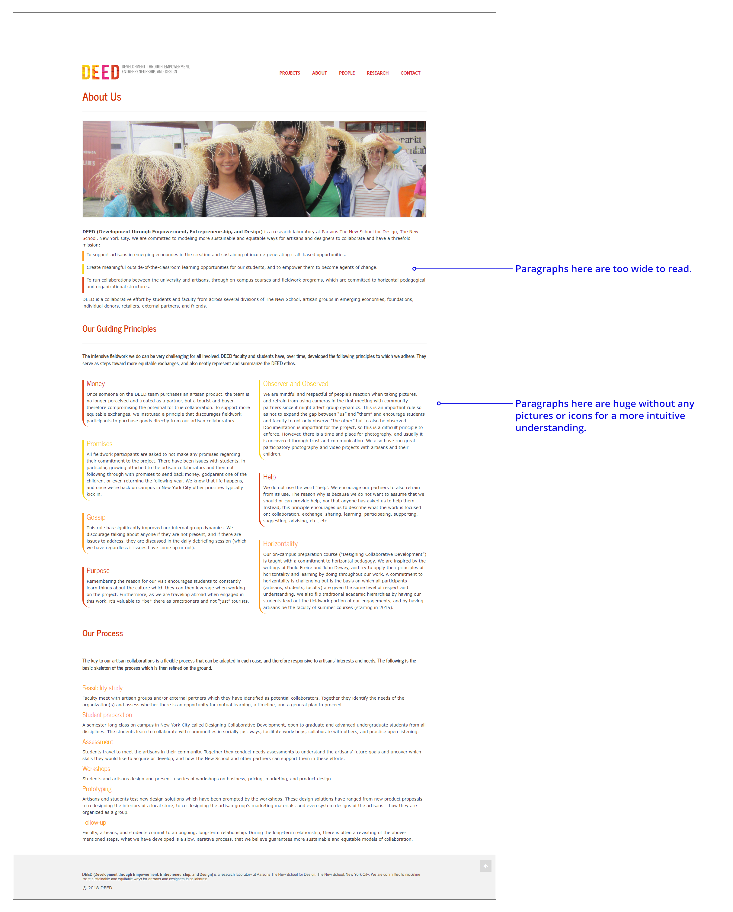
Heuristic Evaluation
︎︎︎ Home & Projects Page

︎︎︎
Project Page
︎︎︎
About Page
︎︎︎
People Page

︎︎︎
Post Page
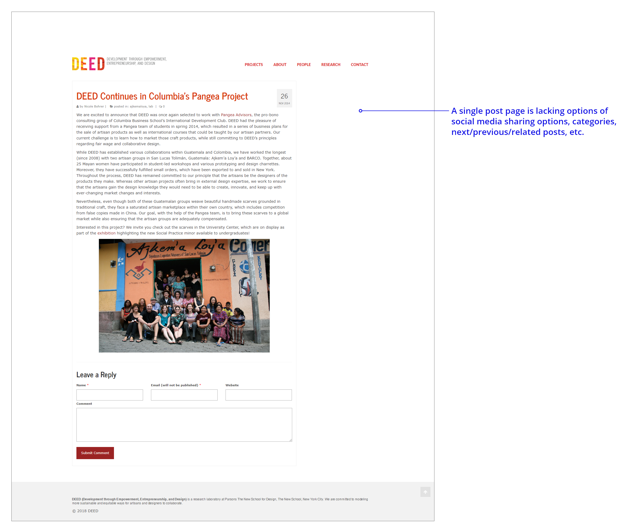
Takeaways
- Paragraphs on most of the old pages had too many words in a line which was not easy to read for users.
-
Line-height and spacing between paragraphs were too narrow which made texts overwhelmed.
-
The old site was text-heavy without informative icons to help convey key messages.
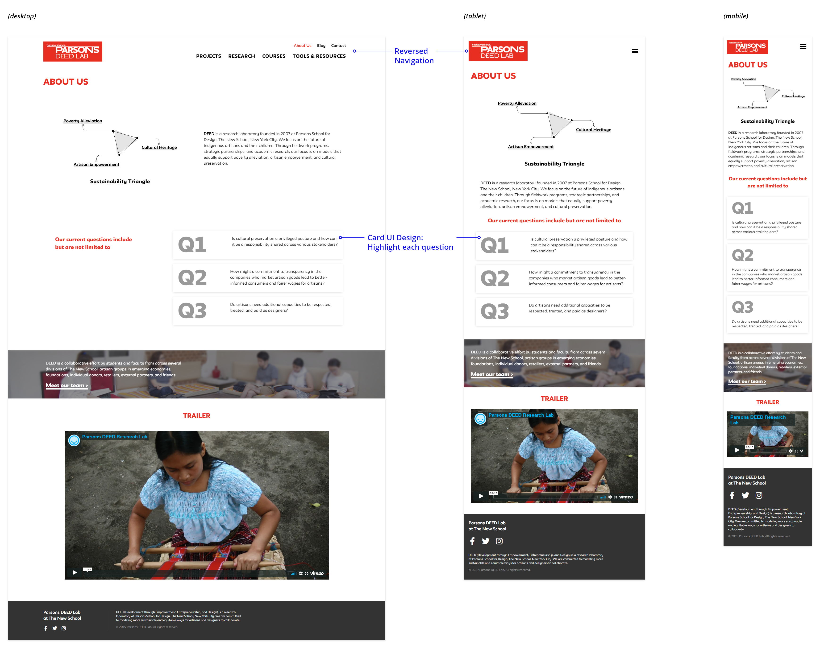
- There were a lot of lists on different pages, and they needed a more organized and intuitive way to show such as card UI design.
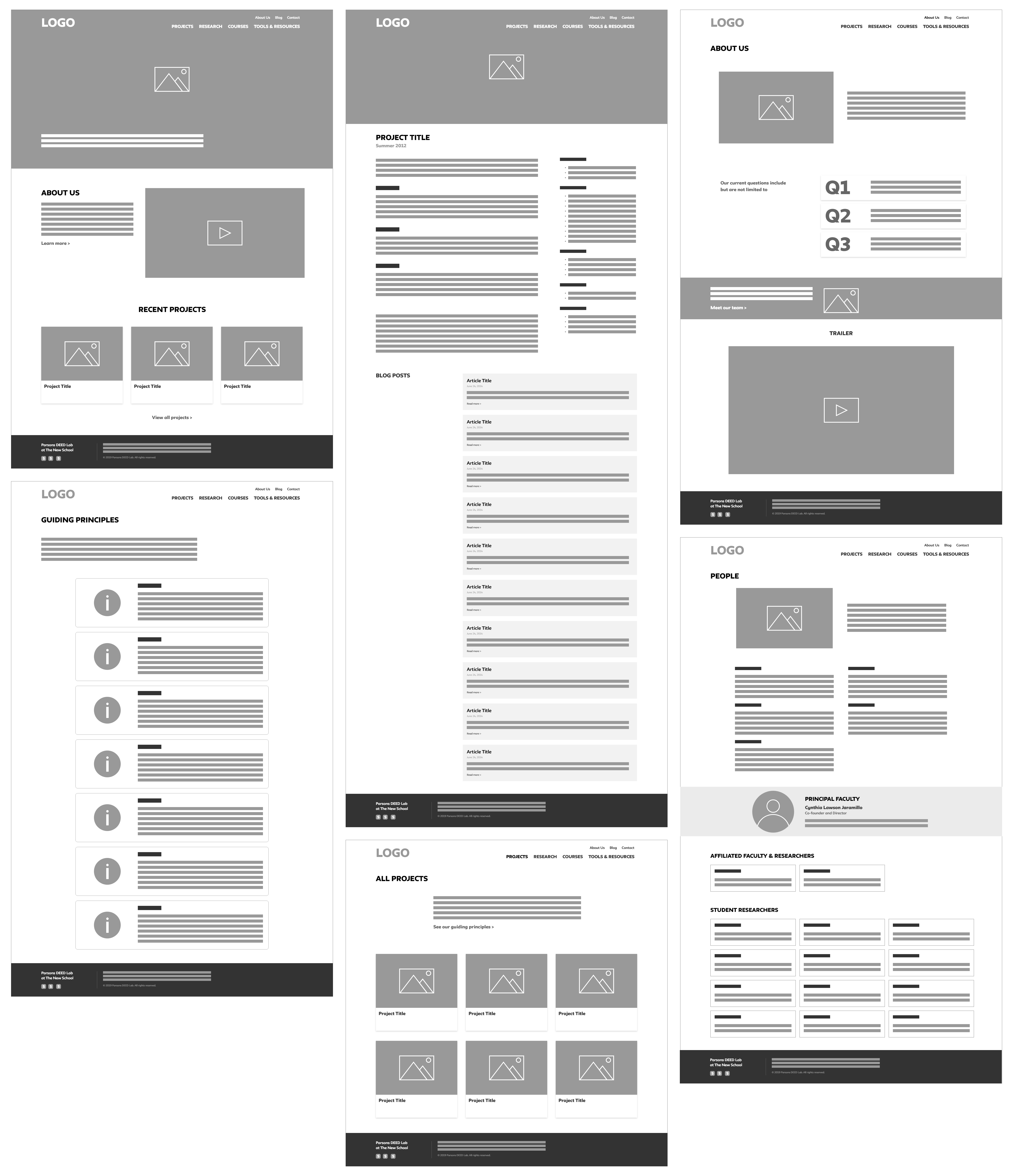
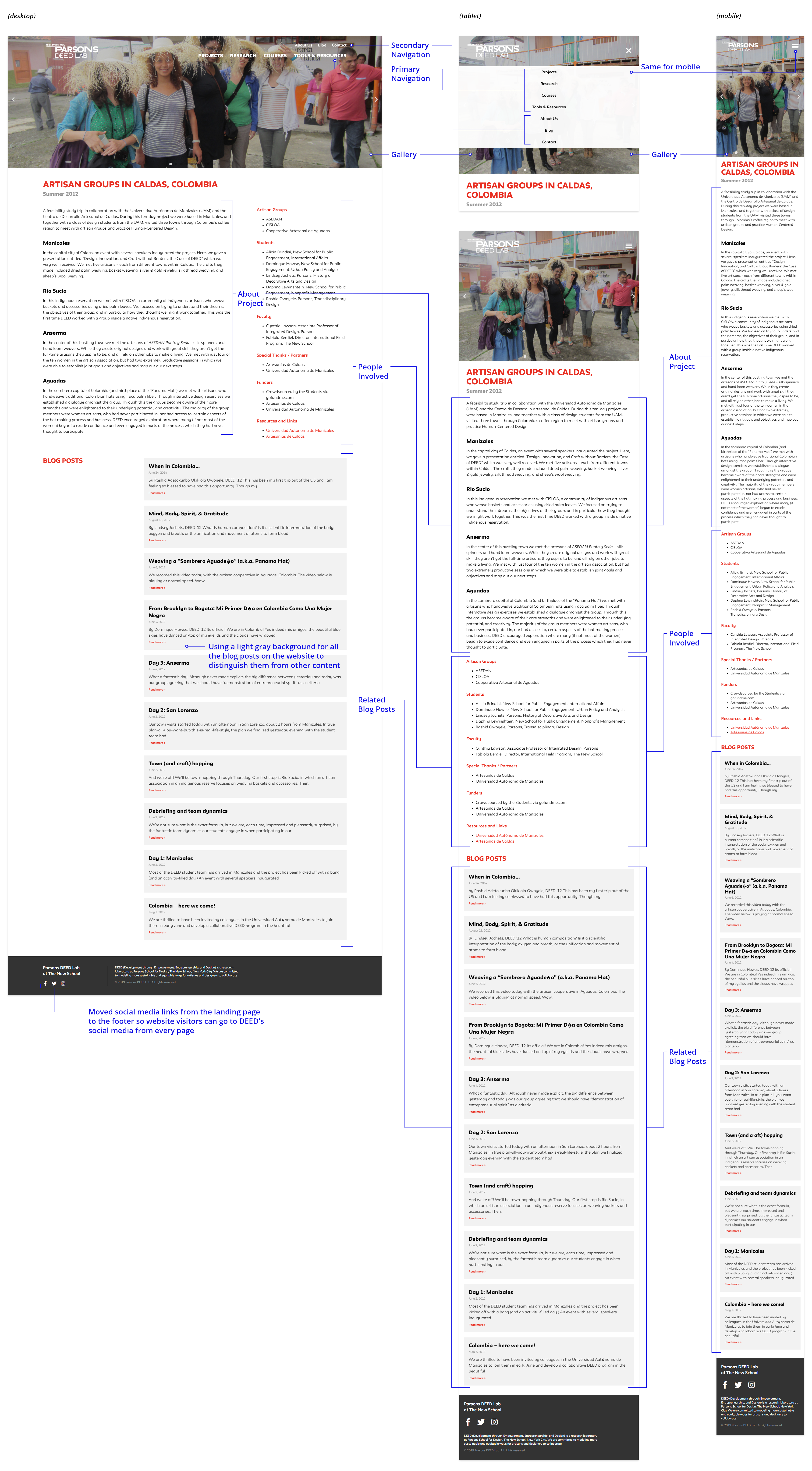
Site Architecture & Wireframe:
Sitemap

Wireframe Sketches

Wireframes
Visual & Interaction Design:
Mockups and Iterations
Based on the new logo designed by the New School marketing team, I came out with a few different combinations for the color palette and applied them to the user interface. Then, I created several iterations of prototypes with different layouts, font sizes based upon the feedback from the director and other team members.
Some of the iterations
Design decisions:
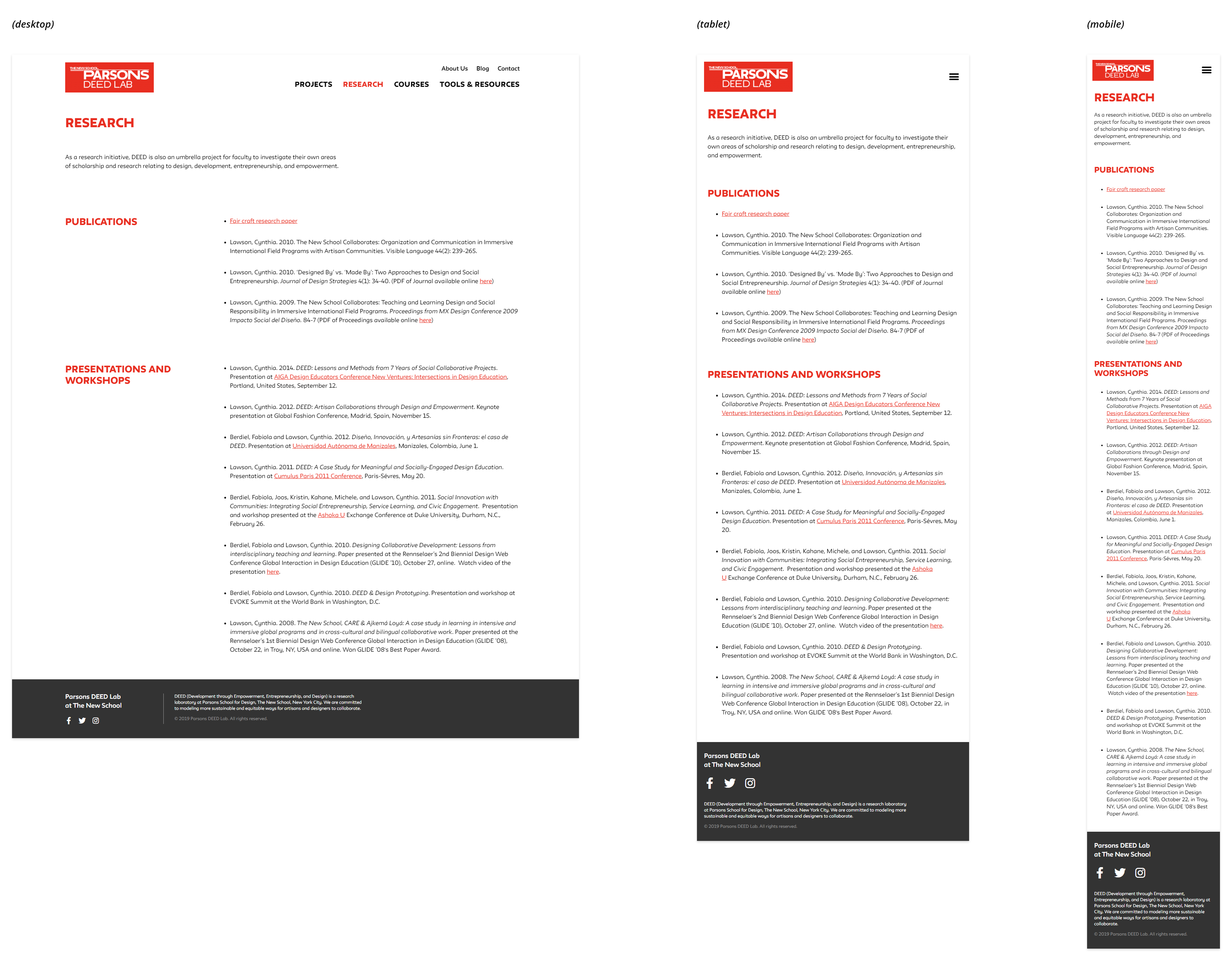
︎︎︎ Breakpoints: tablet - 1025px, mobile - 768px
︎︎︎
Typography: smaller font size for mobile
Final Design Overview
Design System
I created this design system, so the director and other team members could have a style guide for future use and maintenance.
Sticky(Fixed) Header
This two-line navigation design with different font sizes as hierarchy leads the way we want users to navigate the site. Besides, the fixed-on-the-top design also lessens the scrolling needed, which allows users to move around the site quickly while landing on a lengthy page.
Text Selection Color
text color: white
background color: ink
Final UI Screens
︎︎︎ Landing Page

︎︎︎ Project Page
︎︎︎ About Page
︎︎︎ People Page

︎︎︎ Guiding Principles

︎︎︎ Blog
︎︎︎ Blog Post
︎︎︎ All Projects
︎︎︎ Contact Page

︎︎︎ Tools & Resources Page
︎︎︎ Research Page
Learning
From this project, I learned that utilizing prototyping tools in the early stages to communicate design decisions is very important in a cross-functional team. I applied the color palette options and typography to the UI screens, which made it easier for the team to visualize those options they needed to decide on later.